Every faceless creator has opened the audience-retention chart, looked at the line going down, and closed it again. The line always goes down. That is what it does. So the chart gets filed under “depressing”, and the script gets rewritten from the top, on instinct, for the fifth time.
The line going down is not the information. The shape of it is. Here is how to read it in about two minutes, using real curves from channels we run.
Start at the first cliff, not the average
YouTube gives you an average percentage viewed, and it is the least useful number on the page. Two videos can both average 35% and have nothing in common. One loses half its audience in the first twenty seconds and holds the rest to the end. The other holds everyone for three minutes and then bleeds out slowly. Same average, opposite problems, opposite fixes.
So ignore the average. Find the first point where the line drops steeply — the first cliff — and note the timestamp. That timestamp is your diagnosis.
The grey band is the comparison you need
On most of your videos there is a grey band behind the line. That is the typical range for videos of similar length and type. It is the single most useful thing on the chart, and almost nobody uses it.
A line that sits above the band is not just declining — it is declining more slowly than normal, which is a win no matter what the raw percentage says. A line that sits under the band is underperforming even if the number looks respectable to you. Judge the line against the band, not against your feelings about the number.
A cliff before 0:30 — the opening
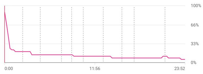
If the line falls off before thirty seconds, the viewer left before you made your point. It is almost always one of three things. The video opened with a greeting, a channel intro or “in this video we’re going to”, instead of the thing they clicked for. Or the thumbnail and title promised something the first sentence did not immediately start delivering. Or the opening was fine but took forty seconds to say what should have taken eight.
The fix is the first sentence, not the script. Rewrite the first fifteen seconds so the promise on the thumbnail is being paid off from word one, and leave the rest alone. You will learn more from that one change than from a full rewrite.
Note what this curve does after the cliff: almost nothing. It is nearly flat for twenty minutes. The people who survived the opening stayed. The content was never the problem.
A steady slide — no stakes
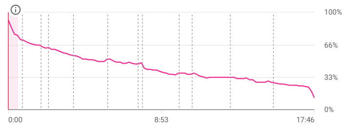
If there is no cliff, just a smooth slope from start to finish, the opening did its job and the body did not. The viewer never had a reason to stay for the next minute. This is the script that “sounds like AI” — not because of the words, but because every section is the same length, every point is introduced the same way, and nothing is ever at risk. Nothing is being argued.
The fix here is structural. Before writing, decide the one claim a viewer might disagree with, and build the video as the case for it. Points that support an argument get watched. Points that follow a list get skipped.
A cliff in the middle — that segment
A sharp drop at a specific timestamp, with a decent hold before and after it, is the easiest of the three. Something at that exact point pushed people out: a tangent, a stretch of footage with nothing happening, a section the title never promised. Watch the thirty seconds before the cliff and you will usually see it. Cut that kind of section from the next script’s structure and move on.
The spike — keep it
Sometimes the line goes up at a point. People are rewinding to it, or being sent to that moment from somewhere else. That is the part of the video your audience valued most, and it belongs closer to the front of the next one.
What the two outcomes actually look like
These two videos are from the same channel, in the same format, weeks apart. YouTube labelled them for us.
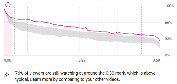
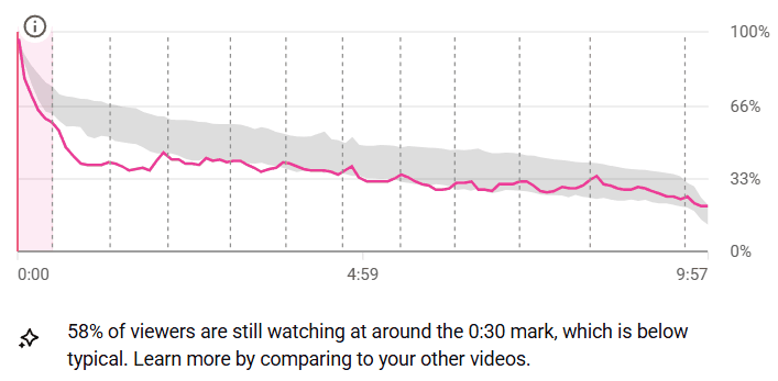
Eighteen points of difference at the 0:30 mark. Not a different niche, not a different format, not a different amount of effort — a different opening. Everything after the first minute in the second chart is a consequence of the first minute, and no amount of rewriting minute six would have recovered it.
That is the whole argument for reading the curve properly. The second video did not need a better script. It needed a better first fifteen seconds, and the chart said so.
What this changes
Reading the curve this way means you change one thing per video, on evidence, instead of everything at once on instinct. Twenty videos from now you will know exactly which change moved the number — and you will have a channel that learns from its own audience instead of someone else’s averages.
The line will still go down. It always does. But you will know where, and why, and what to do about it before the next upload.